A visually engaging summer-themed layout leveraging warm gradients, soft shadows,
and conversational message bubbles to drive organic reach and strengthen brand approachability.
A high-impact paid social creative designed to drive awareness and user acquisition for Tailor Brands’ “Zero Dollar LLC” offer.
The ad highlights a strong value proposition — starting an LLC for $0 — by using bold color blocking, confident copy, and clear visual hierarchy to emphasize the message. This creative maximizes thumb-stopping potential, strengthens ad recall, and supports conversion-oriented performance across paid channels.
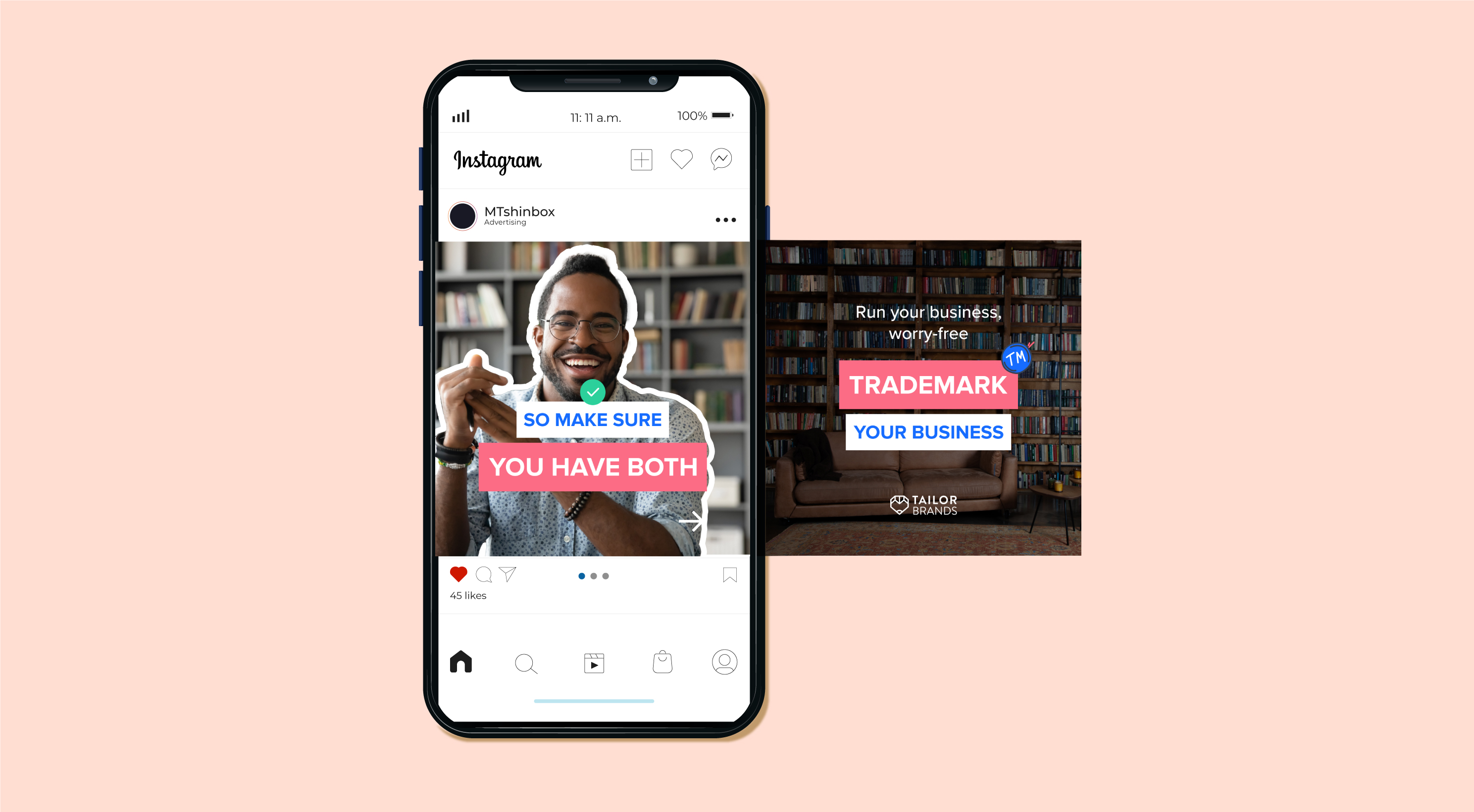
An educational carousel designed to clarify the difference between an LLC and a trademark, using approachable visuals, structured messaging, and a trustworthy tone. The design combines clean layouts, consistent branding, and light playful elements to keep users engaged while delivering clear, helpful information.


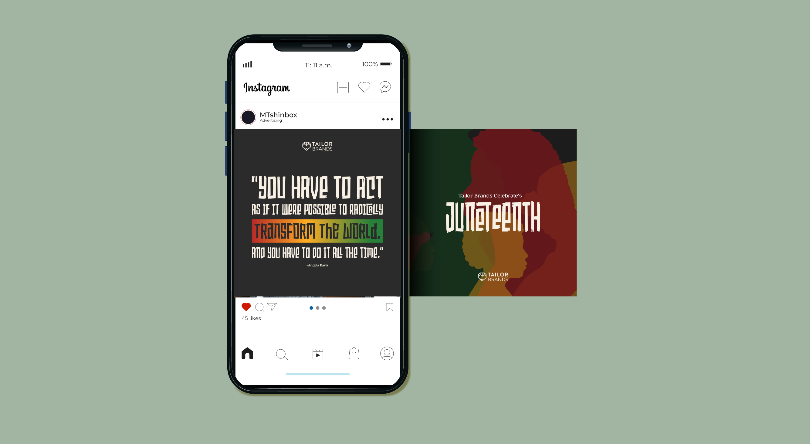
An organic social series created to honor Juneteenth through respectful, culturally aware design.
The visuals use symbolic Juneteenth color palettes and layered silhouettes to reflect history, identity, and progress.
The carousel focuses on delivering an educational, community-minded message in a clear, thoughtful way -
supporting awareness, inclusivity, and brand alignment with meaningful cultural moments.


A vibrant set of Instagram highlight covers designed in alignment with Tailor Brands’ brand guidelines.
A bold and inclusive Pride poster created to celebrate diversity and visibility within the company. Designed with expressive color gradients, confident typography, and warm visual storytelling, the piece aligns with Tailor Brands’ brand values and cultural engagement efforts. The poster was displayed in the company lobby, reinforcing a welcoming atmosphere and highlighting the brand’s commitment to equality and representation.

A careers page designed to reflect Tailor Brands’ values of inclusivity, community, and transparency. The layout uses warm brand colors, approachable typography, and team imagery to create a welcoming narrative for potential candidates. Structured role sections and clear CTAs support easy navigation, while the overall design stays aligned with brand guidelines to strengthen trust, authenticity, and employer identity.

A paid landing page designed to clarify the trademark process for small businesses while supporting Tailor Brands’ acquisition goals. The layout emphasizes the page’s value proposition through clear messaging, a streamlined visual hierarchy, and trust-driven brand elements. Using on-brand color schemes, approachable imagery, and structured FAQs, the page guides users through the conversion journey—reducing friction, answering objections, and strengthening confidence in protecting their brand identity.
.png)
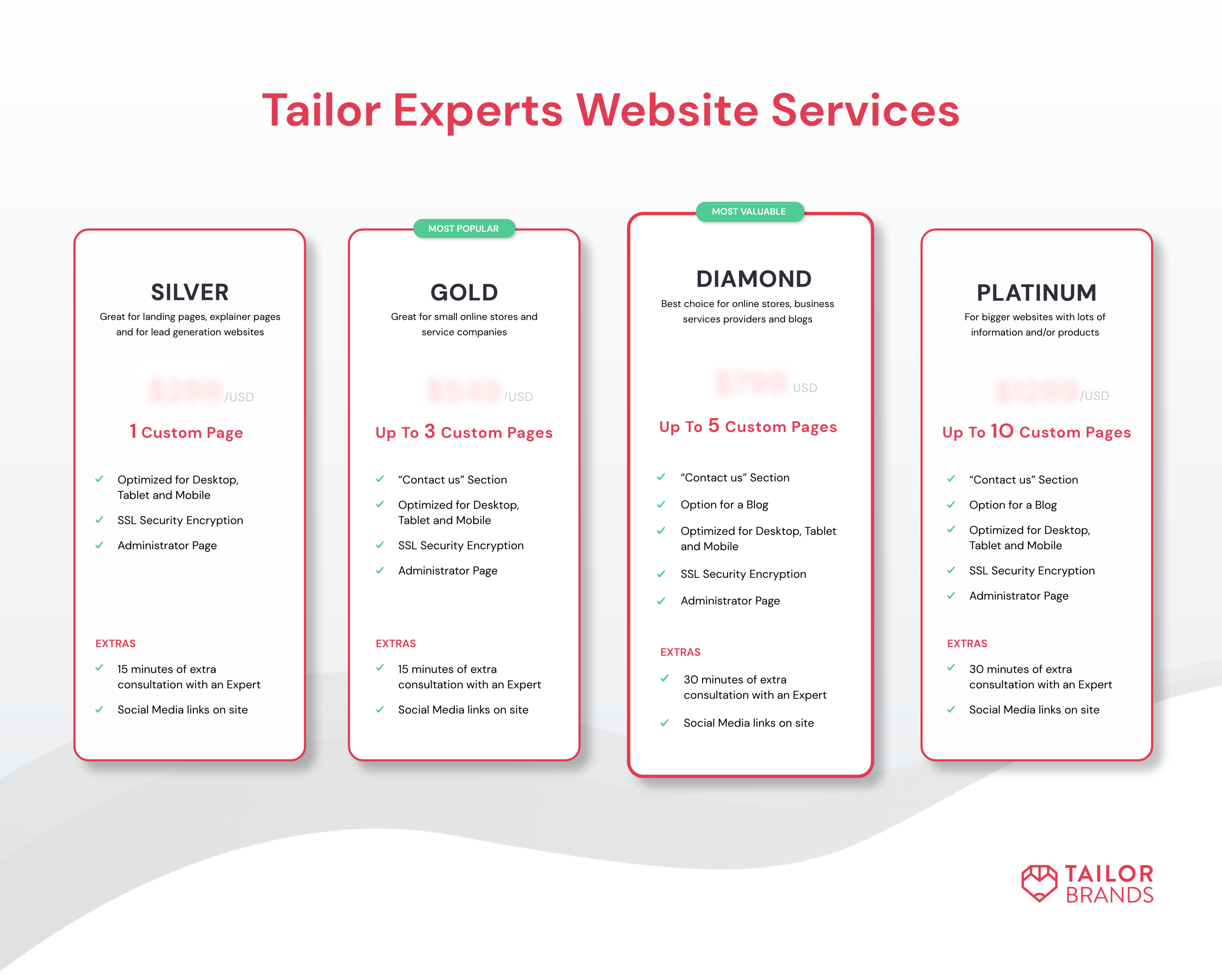
A collaborative UX/UI redesign created with the Head of UX/UI to optimize how users evaluate Tailor Brands’ service plans. The layout presents a tiered pricing structure that improves scannability, reduces cognitive load, and supports value-based decision-making.

Have a project in mind or seeking collaboration?
Contact me for professional UX/UI design services and inquiries.